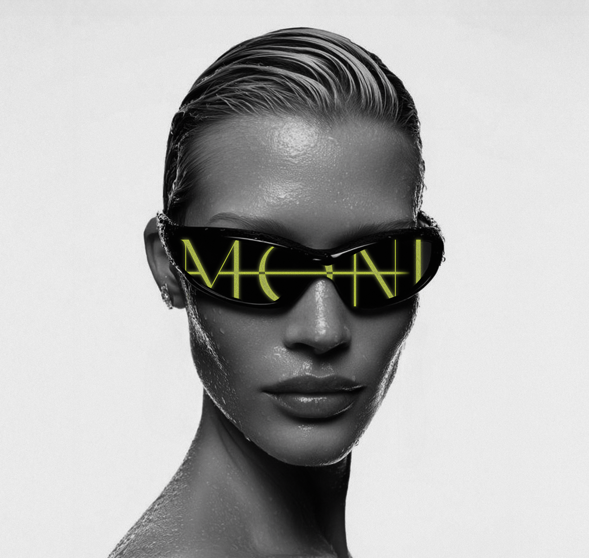
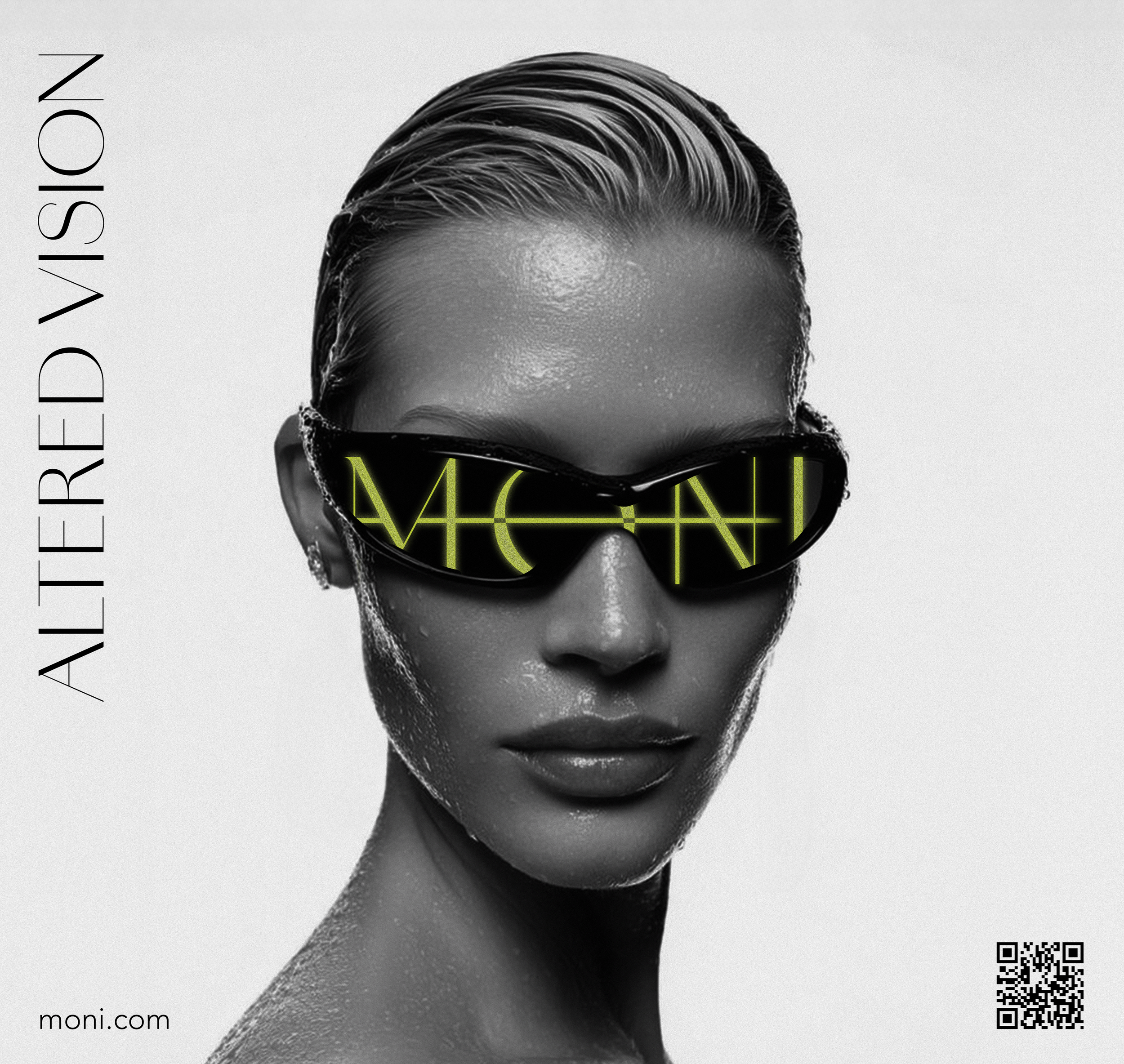
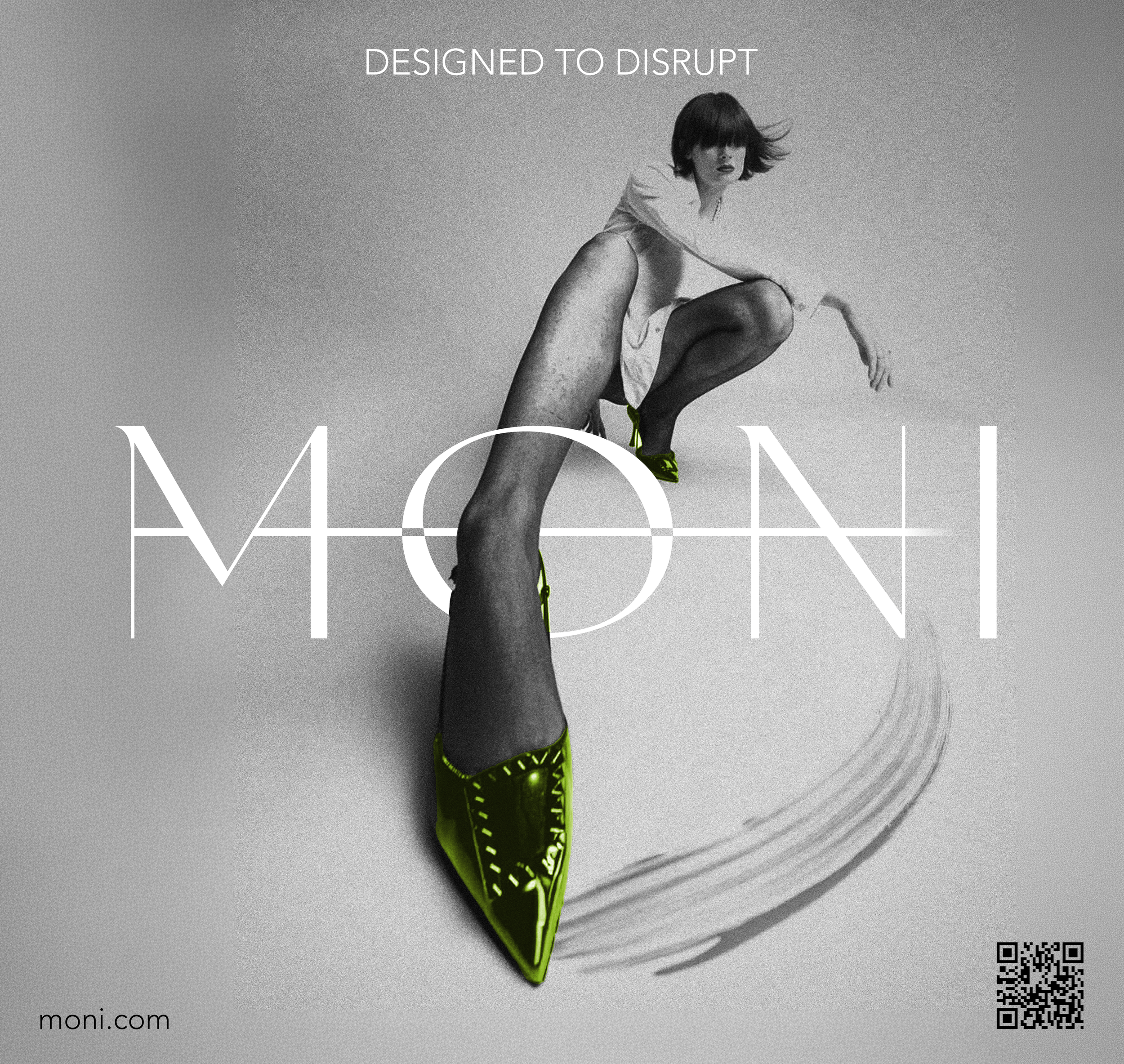
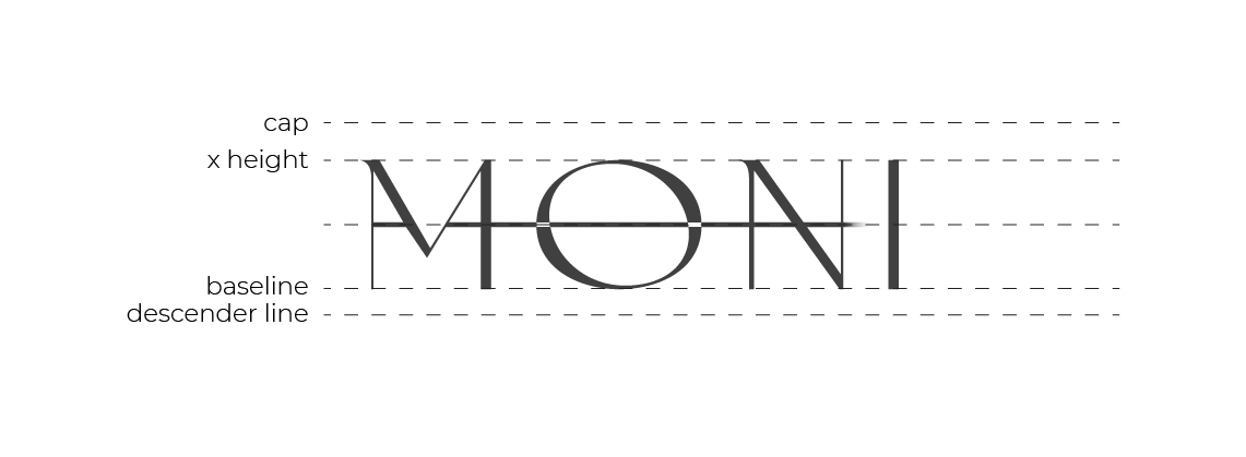
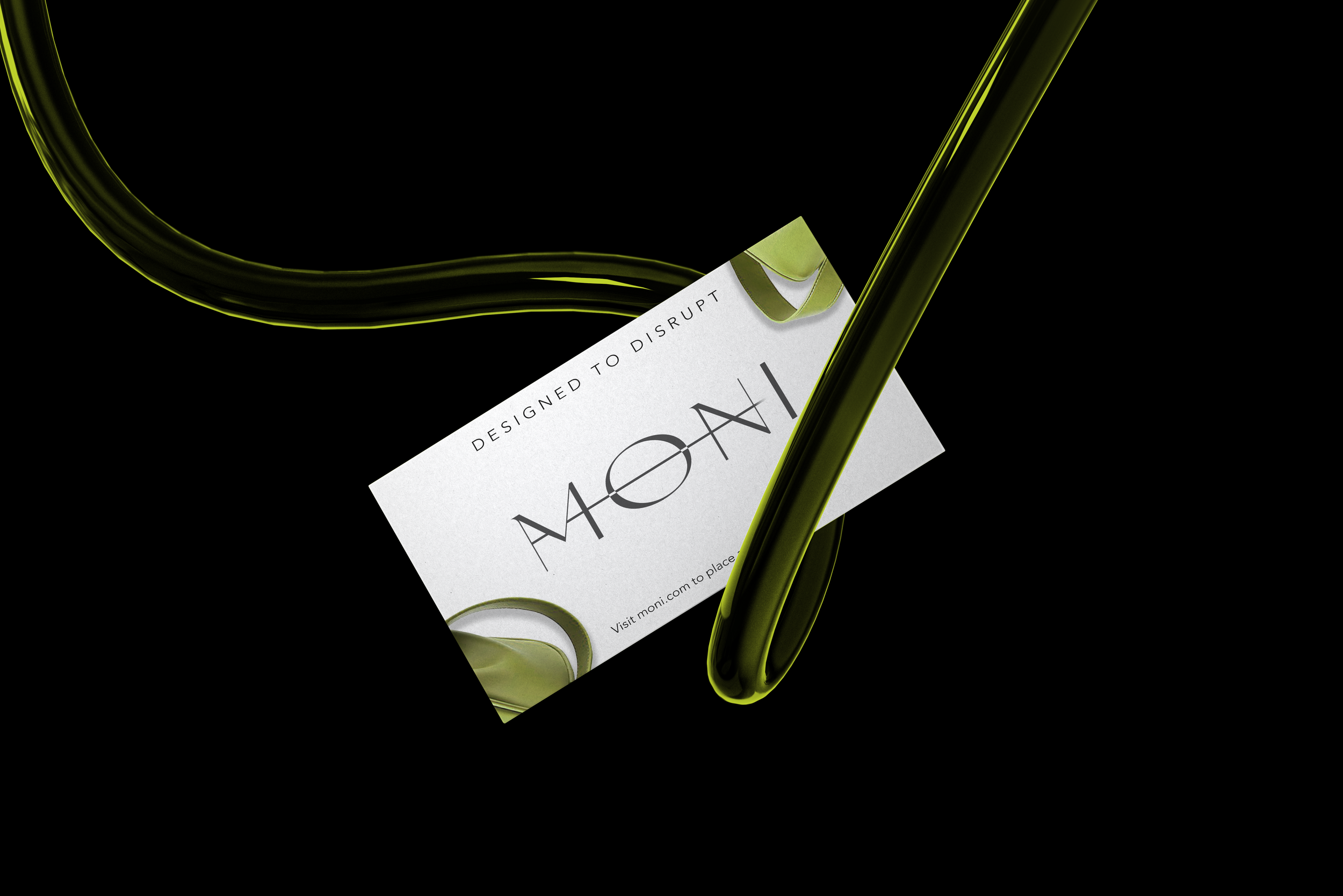
The challenge with designing the logo for MONI was figuring out how incorporate the full name in a manner that read as feminine luxury while also introducing an element of disruption. Brands like Dior served as inspiration for the high-end, editorial style that the clientele requested.
The typeface Amandine was used for its thin stems, and varied line weight. A smooth taper was applied to the typeface to give the logo a more feminine feel.
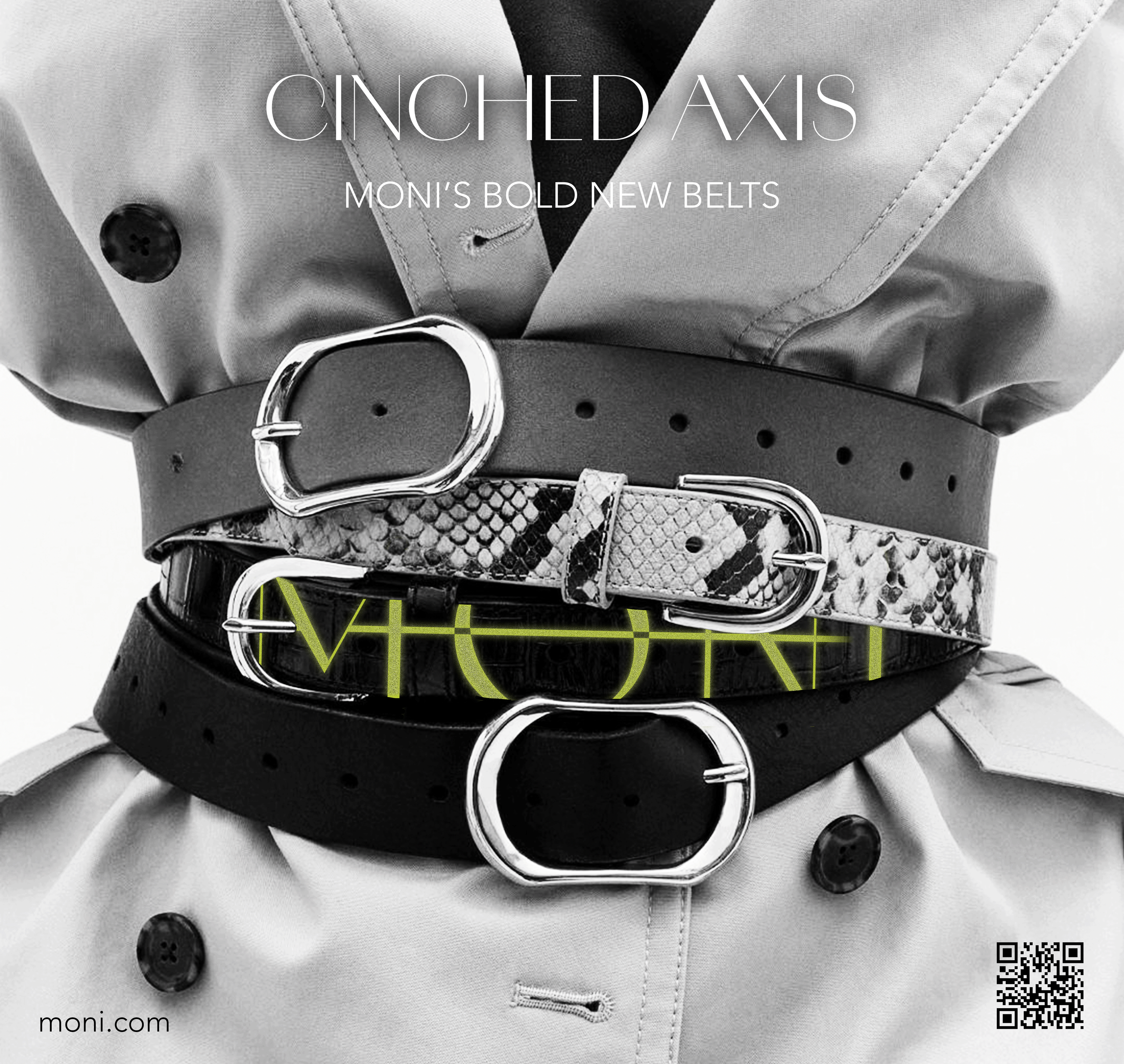
The horizontal line that runs through the typography contributes to the "disruption" brought about by wearing MONI's statement pieces.